Mature women’s clothing can lapse into blandness
Posted by Rose on 14th Dec 2022
Comfortable clothing and colorful clothing aren’t mutually exclusive!

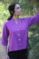
The Sympatico collection draws on a prismatic array of shades.
I’ve often sung the praises of neutrals, especially in the context of capsule wardrobes where everything needs to work with everything. But the truth is, I think our western world at times lapses into blandness with monochrome color schemes dominating everything from home and industrial design to fashions and furnishings.
Sometimes I find myself longing for a burst of vibrancy in what can seem to be a grey world. Not that there’s anything wrong with grey, but there are occasions and days when I’m impelled to inject some color into my world. As I write this we’re receiving the first snow of the season here on the flank of Woodrat Mountain, and to be sure, the suddenly white landscape is lovely. But if the prediction for a La Niña winter with more snow and rain holds true, I know they’ll be days I want plenty of color in my life.
Sympatico’s newest shade, Fuchsia, is a reflection of that need. Maybe counterintuitively, I introduced it at the end of summer as the season turned toward autumn and winter. Likewise, there’s nothing better than coming across some sheltered berries in the snowy woods above our home. When my daughter was little, she had an uncanny ability to discover the first snowdrop blossoms as we traipsed through the woods in the early spring. At the other end of the year she was just as apt to discover a surviving wildflower long after its peers has succumbed to the cold.
Introduced as greyer weather settles in, Fuschia is guaranteed to inject a colorful note.
It’s not my imagination that the world has grown greyer. Fast Company recently published a story about how various shades of grey have come to predominate in all sorts of settings from automotive finishes to fashion shows where grey is second only to black in popularity. But as the article points out, it’s not like we’ve lost any colors, we actually have gained thousands of shades with the development of synthetic dyes, paints, printing inks, and other colorants. Pantone, the company that has standardized color palettes, now has an astonishing 15,000 shades in its library.
It seems to me the colors we are drawn to often reflect our environment. Back when I was doing craft fairs across the western US, I noticed distinct differences in my customers' color preferences. Women in the Northwest leaned toward neutrals where customers in places like Arizona were drawn to desert and adobe shades that evoked their surroundings.
Of course, there’s also a cultural component to color. The vibrant and intense color schemes we see in other parts of the world can sometimes strike us as exotic, as “other.” That’s understandable, but we live in a prismatic natural world, one that sparkles with all sorts of amazing colors, some of which we can only dully replicate. I think some of my recent forays into hand dyeing have been a response to that innate urge to get into color. I invite you to dive into color too!
Share:


